
KODA UI Manual
A guide to designing and exporting a Graphic User Interface for your KODA instrument using Figma.
This document is not finalized for publish and is still being worked on.
Introduction
This documentation covers how to create a Graphic User Interface (UI) for your instrument. You'll design the UI inside of Figma, and then export using the KODA Export plugin, which results in a .kdui (KODA UI) file that you can drag directly onto your instrument in the KODA app.
- In your instrument's file structure on disk, be sure that your
.kduifile and all spritesheets are contained inside yourUIfolder. - If you have made changes to your UI, you'll need to close and reopen the instrument in the KODA app to load the new changes.
- Be sure widgets are contained inside your Main layer (in the lefthand column).
- Be sure all widgets have a Type property.
What You'll Need to Get Started
- Figma - A free account is fine.
- KODA Properties plugin
- KODA Export plugin
KODA Structure
KODA Structure, and How UI Fits In
When building an instrument in KODA, the structure is broken into three parts:
- The Instrument File (
.kd) - Created inside the KODA app. Holds information about the instrument such as sample mappings, group structure, FX, and modulators. - The Graphic User Interface (
.kdui) - Created inside Figma. Responsible for displaying the instrument to the user and passing user input into the instrument via parameters. - The Script (
.cmajor) - Written in an IDE (Visual Studio Code recommended). Connects user input from the UI and MIDI data back to the instrument.
UI / Audio Separation
The UI is handled on a separate thread from the audio, where the Instrument and Script live. This separation ensures audio thread safety while giving the UI its own lane and allowing greater graphic capabilities.
The UI and main instrument are largely independent of each other. They share information by passing values through conduits called parameters, which are always visible to both sides. In most cases, you'll create UI widgets and assign a unique parameter name along with minimum and maximum values.
Parameters are exposed to all three parts of the KODA structure:
- The Instrument File (in the Setup tab).
- The UI - widget states are directly tied to parameters (e.g. a button or slider).
- The Script - parameter changes trigger an event callback where parameter values are passed in.
Overview
Inside a Figma design project, you'll have a frame layer named Main. This is the main body of the instrument. Any static images contained in it will form the wallpaper background.
Inside the main body, you'll have UI widgets - appearing in Figma's lefthand column as layers with purple lettering and a ❖ or ◇ glyph. Examples: Sliders, Buttons, Menus.
Widget behavior is defined primarily by attached properties. You can view the properties of a selected widget in the upper righthand column. To add or modify them, use the KODA Properties plugin inside Figma.
Other key elements that define widget behavior include layer naming, and the color and text used inside the layers of your widget. Non-purple layers inside Main will be static images.
Optionally, some aspects of widgets can be changed via script during runtime - such as hiding, repositioning, opacity, and rotation. These are handled via GUI Actions inside of cmajor.
Once ready, use the KODA Export plugin in Figma to export as a .kdui file. The UI will appear when you load the attached instrument in the KODA app. If not yet attached, drag the .kdui onto the instrument from disk and save.
Main (Instrument Body and Wallpaper)
An instrument requires you to designate an area for the main body and wallpaper background. Drag in an image or create a rectangle, then name the layer Main in the Layers column. Right-click and choose Frame Selection (⌥⌘G on Mac, Ctrl+Alt+G on Windows). You should see a ⌗ appear next to the Main layer. The dimensions of the Main frame determine the size of your instrument.
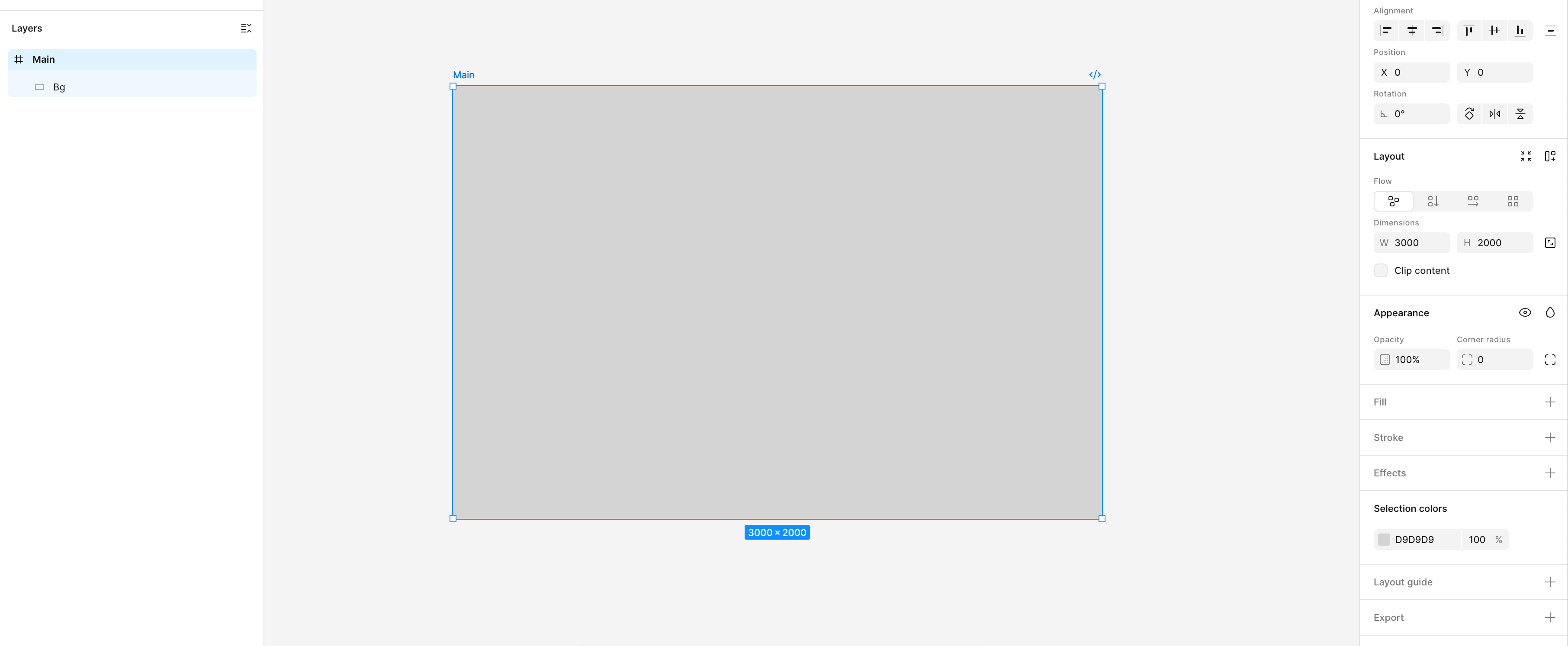
A simple example of a Main frame.
You can place any static images or text inside the frame. As long as the layer is not purple in the Layers column (i.e. not a component or instance) and is nested inside the Main frame, it will appear as a static, unchanging element.
- You can only have one Main in your project.
- Images must be contained within the bounds of the Main layer. Be sure to crop any images that extend outside the bounds.
- Make sure all widgets are nested inside the hierarchy of the Main layer.
UI Widgets
Widget Types
Widgets are the dynamic elements built into the GUI that allow the user to interact with the instrument. They appear in the lefthand Layers column in purple, with a ❖ or ◇ glyph next to them.
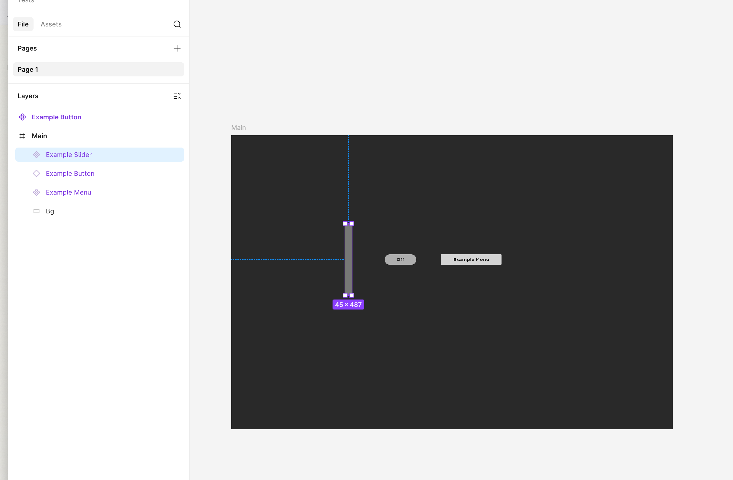
Examples of UI widgets.
Properties
Widget behavior is defined primarily by attached properties. At a minimum, widgets must have a Type property (declaring what it is - e.g. slider, button, menu), and typically have a Parameter property declaring a unique name that allows the widget to pass values into the instrument.
You can view properties in the upper righthand column by clicking on the widget's component (❖).
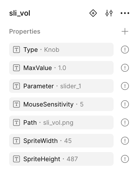
Example of properties for "sli_vol"
To add or modify them, open the KODA Properties plugin, select the widget, enter the values, and press Apply. Properties can also be edited manually in Figma, but the plugin is recommended.
Only component layers can contain component properties (❖). If your widget is an instance (◇), right-click and select Go to Main Component to add properties.
Other Important Elements
In addition to properties, other elements affect widget behavior depending on the specific widget type. Keep the following in mind:
- Fill color - Level Meters and Tables use a fill color from your layer to determine bar color.
- Font sizing, color, and justification (left / center / right) - Affects the text appearance of Labels, Value Edits, and Menus.
- Layer naming - Naming a layer
Backgroundresults in a static background image, useful for framing widgets like Labels, Value Edits, and Menus. Panel names are used for tab-switching behavior via the Variant Name property.
Components / Variants / Instances
Components
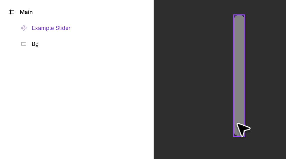
Example of a component.
Components are special layer types displayed in purple in Figma's lefthand column. In KODA, they designate a layer as a UI widget.
To convert a normal layer or group into a component, right-click and select Create Component (⌥⌘K on Mac, Ctrl+Alt+K on Windows). The layer will turn purple and show a ❖ symbol. From here you can add properties, place it in your instrument, and use it as a widget - for example, when building a slider or button using a spritesheet.
Variants
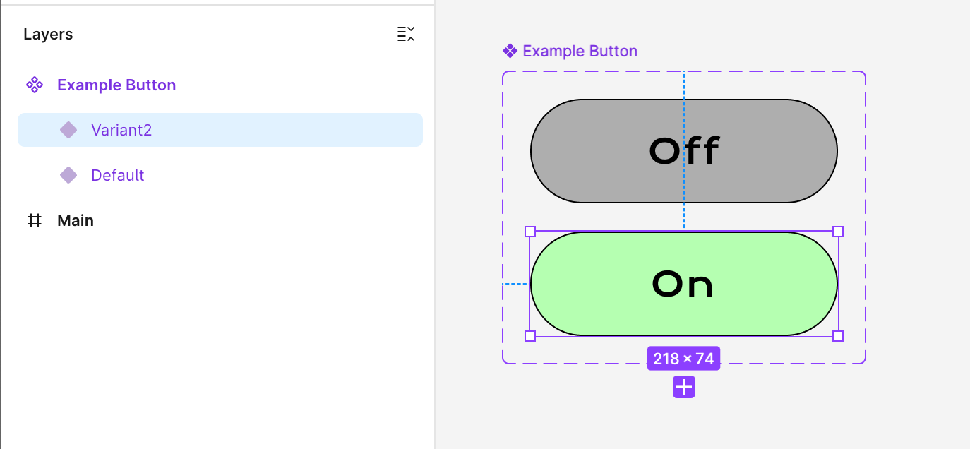
A component set containing two variants: “Default”, “Variant2”.
If you're creating a button with off/on states without a spritesheet, select the component, right-click, and choose Main Component → Add Variant. A second instance of your button will appear below the first. In the Layers column, two ◆ layers will be nested inside the ❖ container (technically a "Component Set"). Use the + button to add more variants, then customize each one's appearance to convey different states.
Instances
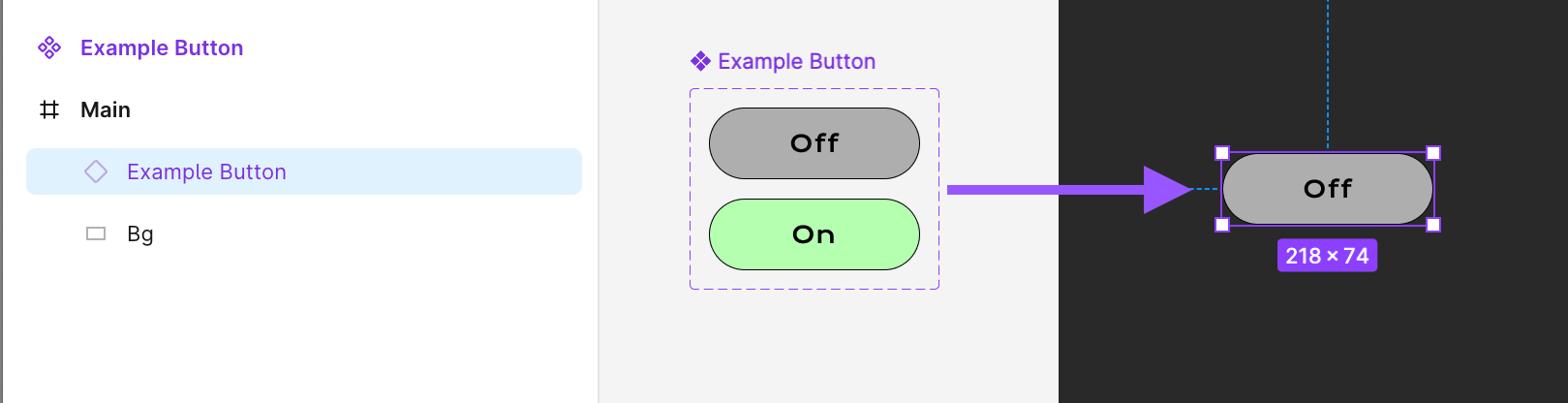
An instance of the component is placed in the instrument’s Main body.
Once a component contains multiple variants, keep the stack of layers off to the side rather than placing it directly in Main. Select one of the variant layers, hold ⌥ / Alt while dragging, and a new layer with a ◇ symbol will appear - this is an instance.
The instance looks identical to the variant it was dragged from. By right-clicking and selecting Change Variant, you can swap the instance's appearance to any of the variants. This is the core approach for creating and managing button states.
After placing the ◇ layer inside Main, open the KODA Properties plugin to add the button state properties that allow states to function at runtime.
Animation: Four Methods
The Slider, Animation, and Button widgets support visuals that move or change. KODA offers four methods - the first two are authored entirely in Figma, while the last two are driven from your cmajor script:
A strip of images stacked vertically or horizontally, each containing one frame.
✗ Fixed resolution. Predetermined states only.
Frames consist of Figma component variants. Supports PNG and SVG - SVG scales cleanly at any resolution. Buttons can be assigned to specific states (Off, On, OverOff, etc.).
✗ Not ideal for high frame-count animations.
Draw directly onto a widget's canvas from your cmajor script - vector shapes, paths, arcs, gradients, images, and text, composited in layers. Ideal for value-driven visuals that redraw as a parameter changes, such as a knob's arc fill or a custom meter.
✗ Requires scripting; redrawn from script as values change.
Change a widget's live properties from your cmajor script at runtime - visibility, position, size, opacity, rotation, and state - with optional duration and easing for smooth transitions.
✗ Requires scripting; acts on whole widgets, not custom drawing.
Quickstart Guide
Make a Slider, Animation, Or Button Using a Spritesheet
- Be sure your spritesheet is located inside the UI folder for your sample library.
- Open the KODA Properties plugin. Make sure to set the Type to
Slider,Animation, orButton. - Drag the spritesheet from disk onto the drop zone marked with a dashed outline in the Spritesheet & Variants section.
- Set the number of frames and orientation. Press Continue when finished previewing.
- Buttons only: In the Button States section, enable the button states present in your spritesheets and drag to arrange the order to match. If unedited, a six frame spritesheet defaults to: Off, On, ClickOff, ClickOn, OverOff, OverOn. Two frames defaults to: Off, On.
- At the plugin bottom, drag out from the dashed drag area into your Figma project. After a brief pause, the component with your properties will appear. Place this in your instrument, and be sure it's contained within the Main frame layer.
Make a Button or Animation Using Variants
- Start by making a single frame, such as an "Off" button state. Note: this should be off to the side from your instrument's Main body.
- Turn into a single ❖ component by right-clicking and selecting Create Component (
⌥⌘Kon Mac,Ctrl+Alt+Kon Windows). - Add a ◆ variant by selecting the ❖ component, right-clicking, and choosing Main Component → Add Variant.
- With the ❖ component selected (not a variant inside the component), you'll be able to add additional variants by pressing a "+" icon under the component set frame.
- Now, with duplicates of your first image in each variant frame, you can make visual changes for each button state or animation frame.
- When finished, drag out an ◇ instance by first selecting a ◆ variation, then holding
⌥/Altwhile dragging. Place the ◇ instance inside your instrument's Main body. - Open the KODA Properties plugin. Make sure to set the Type to
ButtonorAnimation. (Slideris also valid, but less common.) - Optional: With your ◇ instance (or ❖ component) selected, navigate to the Spritesheet & Variants section. Press the Preview Variants button.
- Buttons only: In the Button States section, enable the button states present in your variants and drag to arrange the order to match your variants. If unedited and six frames, it defaults to: Off, On, ClickOff, ClickOn, OverOff, OverOn. Two frames defaults to: Off, On.
- With your ◇ instance (or ❖ component) selected, press Apply at the bottom to apply the component properties for your UI widget.
- When using ◆ variants, plan ahead to be sure all of your frames have matching dimensions! For instance, if a button moves down for its "On" state, it might poke out from the bounds of the frame. You might need to place a slightly larger rectangle with 0% fill opacity to make the frame larger to accommodate movements that would exceed the frame dimensions.
- When adding ◆ variants, each new frame is added underneath the last. However, when looking at the Layers hierarchy (lefthand column), each new ◆ variant layer is placed above the preceding variant layer. This is just how things work in Figma.
- When using ◆ variants, the ❖ component should be off to the side of your instrument body, and the ◇ instance is placed directly in your instrument body.
- With an instance selected, you can toggle which frame to show by right-clicking and selecting Change Variant.
- Since ◇ instances can't directly contain component properties, you'll instead add properties to the associated ❖ components. To jump from an ◇ instance to its associated ❖ component, right-click the instance and select Go to main component (
⌃⌥⌘Kon Mac,Ctrl+Alt+Shift+Kon Windows).
Make a Menu
- Create a rectangle. Add example text to the inside. (E.g. "Item 1"). The appearance of your menu when closed will depend on the text size, text color, and text alignment.
- Select all menu layers and turn into a ❖ component by right-clicking and selecting Create Component (
⌥⌘Kon Mac,Ctrl+Alt+Kon Windows). - Select the background rectangle layer and name it
Background. Naming a layer "Background" inside a Widget tells it that you want this layer to be included as a static background image for your widget. If you skip this step, your menu will not have any background image. - Open the KODA Properties plugin. Set the Type to
Menu. - In the Item List text field, enter each menu item separated by a line break. (Drag the lower right corner if you need to expand the text field size.)
- Verify that Max Value is set to the number of items, minus one. (The first item is zero.) It should be updated automatically every time you update the Item List field.
- Making sure your ❖ component is selected, press Apply at the bottom to apply the component properties for your UI widget.
- In your Figma project, selecting your text layer and holding
⌥/Altallows you to expand the width of the text area, to help give it room to display properly. -
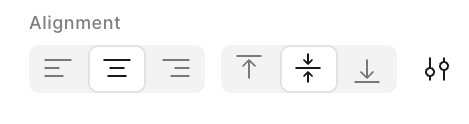
Pay attention to the text alignment of your text layer in Figma, as it determines the alignment of the UI Widget.
Exporting From Figma to Your Instrument
- Open the KODA Export Plugin in Figma (Right-click. Plugins › Development › KODA Export › Export GUI).
- Press Export Components.
- Make sure you are saving inside your instrument's UI folder.
- In the KODA app, close and reopen your instrument to load the new UI changes.
Widget Property Reference
Color can also be written as Colour and will work the same. Spacing and capitalization are stripped out and won't affect property recognition - for example, BarColor, barcolour, and Bar Color are all treated identically.
Properties Common to All Widgets
| Property | Value Type | Description |
|---|---|---|
| Parameter | Text | The UI widget passes a value into your instrument using this name. |
| Min Value | Float | Defines the low end of the parameter range. Defaults to 0 when blank. |
| Max Value | Float | Defines the high end of the parameter range. Defaults to 1 when blank. |
| Default Value | Float | Value when the instrument is first initialized. Ctrl/Cmd + click also restores a widget to its default. |
| Tooltip | Text | Help text displayed when the user hovers their mouse over the widget. |
Slider
- Horizontal Slider - Responds to left/right mouse drags
- Vertical Slider - Responds to up/down mouse drags
- Knob - Responds to all directions
- State Display - Does not respond to the mouse
| Property | Value Type | Description |
|---|---|---|
| Value At Midpoint | Float | Distributes values along a curve so the value specified here occurs at the halfway point. Use either this or Skew Factor. |
| Skew Factor | Float | Distributes values along a curve. Above 1.0 adds resolution at the lower end; below 1.0 adds resolution at the higher end. Use either this or Value At Midpoint. |
| Step Size | Float | Assigns the smallest increment of change. |
| Snap to Mouse | Boolean | Jumps slider value to the click position. Usually left on. |
| Mouse Sensitivity | Float | Range: 0-100. Higher values add more drag resistance. |
| Text Entry Enabled | Boolean | When true, the user can double-click the slider to open a text entry box and type in a value. Default is false. Enabling this also turns off Ctrl/Cmd + click to restore the default value. |
| Path | Text | Spritesheet file path relative to the ui folder. |
| Sprite Width | Float | Pixel width of a single spritesheet frame. |
| Sprite Height | Float | Pixel height of a single spritesheet frame. |
| Vertical | Boolean | Sets spritesheet orientation. Default is vertical (true). Set to false for horizontal spritesheets. |
| Export Format | Text | PNG or SVG. PNG exports a fixed-resolution raster image. SVG exports vector graphics that stay sharp at any size. Affects the Figma export only. |
Button
| Property | Value Type | Description |
|---|---|---|
| Radio Group | Text | Turns a group of buttons into radio buttons. When one is pressed, all others in the group are forced off. |
| Set To Value | Integer | Use with a group of Buttons sharing a parameter and Radio Group. Sets the parameter to the specified value instead of 0 or 1. |
| Group ID | Text | When Panels and Buttons share a Group ID, buttons can control which panel is displayed via the Variant Name. |
| Default Tab | Text | When using Group ID to toggle panel visibility, sets the default panel using this button's component name. Requires a Radio Group. |
| Show / Hide | Boolean | When using Group ID to toggle panel visibility, allows re-clicking the active button to hide all panels. |
| Variant Name | Text | When using Group ID to toggle panel visibility, names the panel variant to display when this button is active. |
| Articulation Name | Text | When using buttons sharing a Radio Group to switch Articulations, names the Articulation selected when this button is active. |
| Path | Text | Spritesheet file path relative to the ui folder. |
| Sprite Width | Float | Pixel width of a single spritesheet frame. |
| Sprite Height | Float | Pixel height of a single spritesheet frame. |
| Vertical | Boolean | Sets spritesheet orientation. Default is vertical (true). Set to false for horizontal. |
| Off | Integer | Spritesheet frame index for the Off state. |
| On | Integer | Spritesheet frame index for the On state. |
| Click Off | Integer | Spritesheet frame index shown while the mouse is held down on a button that is On (clicking it off). |
| Click On | Integer | Spritesheet frame index shown while the mouse is held down on a button that is Off (clicking it on). |
| Over Off | Integer | Spritesheet frame index for hover while Off. |
| Over On | Integer | Spritesheet frame index for hover while On. |
| Export Format | Text | PNG or SVG. PNG exports a fixed-resolution raster image. SVG exports vector graphics that stay sharp at any size. Affects the Figma export only. |
Panel
| Property | Value Type | Description |
|---|---|---|
| Parameter | Text | On a Panel, the parameter value selects which variant is visible. The range from Min Value to Max Value is divided evenly across the variants. |
| Group ID | Text | When Panels and Buttons share a Group ID, buttons can control which panel is displayed using the Variant Name. |
| Default Variant | Text | Name of the variant to display when the UI first loads. Must match one of the Panel's variant names. |
| Click Outside Hides | Boolean | When true, the panel hides if the user clicks outside its area. Useful for closing menus without a dedicated close button. |
| Floating Window | Boolean | When true, the panel becomes a draggable floating window always shown as the top layer. Double-click to reset position. |
| Scrollable | Boolean | When true, the panel allows scrolling if its contents exceed its boundaries. |
Animation
| Property | Value Type | Description |
|---|---|---|
| Frame Rate | Float | Controls animation speed in frames per second. Supports decimals for sub-1fps speeds. |
| Looping | Boolean | If true, the animation plays continuously. If false, it plays once and stops at the end. |
| Path | Text | Spritesheet file path relative to the ui folder. |
| Sprite Width | Float | Pixel width of a single spritesheet frame. |
| Sprite Height | Float | Pixel height of a single spritesheet frame. |
| Vertical | Boolean | Sets spritesheet orientation. Default is vertical (true). Set to false for horizontal. |
| Export Format | Text | PNG or SVG. PNG exports a fixed-resolution raster image. SVG exports vector graphics that stay sharp at any size. Affects the Figma export only. |
Label
| Property | Value Type | Description |
|---|---|---|
| Default Text | Text | Text to display on initialization. If not set, the text layer inside the Figma component is used instead. |
| Text Entry Enabled | Boolean | When true, the user can enter their own text value. |
| Unit | Text | Using presets for common units adds a suffix and formatting. Options: None, Frequency, Decibels, Percent, Milliseconds, Pan, Note Name. |
| Num Decimals | Integer | Number of decimal places displayed. Must be 0 or above. |
| Step Size | Float | Rounds values the user types in to the nearest step. Only applies when Text Entry Enabled is true. |
| Text Case | Text | Forces all text to display in upper or lower case. Options: None, Upper, Lower. |
| Prefix | Text | Adds static text before the value. Example: Gain: |
| Suffix | Text | Adds static text after the value. Example: dB |
| Inactive Timer Seconds | Float | Invisible countdown timer that starts after the user changes this Label's parameter value. Triggers Text When Inactive or Hide When Inactive. Defaults to 1 second. |
| Text When Inactive | Text | Text displayed when the Inactive Timer elapses. If blank, the Label continuously shows the parameter value. |
| Hide When Inactive | Boolean | When true, the entire label hides when the Inactive Timer elapses. |
Level Meter
| Property | Value Type | Description |
|---|---|---|
| Bus | Integer | Identifies a bus by number. Buses are numbered in the order created in the Engine, starting at 1. Default is 0 (Master Bus). |
| Bus Name | Text | Identifies a bus by its name in KODA. Takes priority over Bus when set. Bus names are unique and keep working when buses are added, deleted, or reordered. If no bus matches, the meter shows empty and a message appears in the console. |
| Channels | Text | Mono or Stereo. |
| Orientation | Text | Horizontal or Vertical. If blank, determined automatically by whether height or width is greater. |
| Min Decibels | Float | Must be 0 or below. |
| Bar Color | Hex Alpha | Color of the main bar. AARRGGBB or RRGGBB format. A lighter tint of the same color fills from the bar up to the peak indicator. |
| Peak Color | Hex Alpha | Color of the peak indicator, which follows the held sample peak from the engine. |
| Clip Color | Hex Alpha | Color displayed when the signal peaks at 0 dBFS (clipping). Defaults to red. The bar turns this color for about a second after the last over, then returns to normal. Click the meter to clear it early. |
Table
| Property | Value Type | Description |
|---|---|---|
| Max Value | Float | On a Table, bars span from 0 to this value, or from -MaxValue to +MaxValue when Bipolar. Defaults to 1. |
| Array Name | Text | The UI widget passes an array into your instrument using this name. (Not yet implemented.) |
| Columns | Integer | Range: 1-256. |
| Bipolar | Boolean | When enabled, bars grow up and down from the center. Values range from -MaxValue to +MaxValue. |
| Bar Spacing | Float | Space between bars in pixels. Defaults to 2. |
| Bar Color | Hex Alpha | Color of the bars. AARRGGBB or RRGGBB format. |
| Background Color | Hex Alpha | Color of the Table's background. |
Text Edit
| Property | Value Type | Description |
|---|---|---|
| Default Text | Text | Text to display on initialization. If not set, the text layer inside the Figma component is used instead. |
| Max Length | Integer | Maximum number of characters the user is allowed to type. Blank or 0 means no limit. |
Value Edit
| Property | Value Type | Description |
|---|---|---|
| Value At Midpoint | Float | Distributes values along a curve so the value specified here occurs at the halfway point. |
| Step Size | Float | Assigns the smallest increment of change. |
| Unit | Text | Using presets for common units adds a suffix and formatting. Options: None, Frequency, Decibels, Percent, Milliseconds, Pan, Note Name. |
| Num Decimals | Integer | Number of decimal places displayed. Must be 0 or above. |
| Mouse Sensitivity | Float | Range: 0-100. Higher values add more drag resistance. |
| Prefix | Text | Static text shown before the value. Not shown while typing a new value. |
| Suffix | Text | Static text shown after the value. Not shown while typing a new value. |
| Text Case | Text | Upper or Lower forces the whole display, including prefix, suffix, and unit text, into that case. |
XY Pad
| Property | Value Type | Description |
|---|---|---|
| X Parameter | Text | When moved, the XY Pad passes the cursor's horizontal position into your instrument using this name. |
| Y Parameter | Text | When moved, the XY Pad passes the cursor's vertical position into your instrument using this name. |
| X Min | Float | Default is 0.0. |
| X Max | Float | Default is 1.0. |
| X Default | Float | Value and position when the instrument is first initialized. If blank, uses the axis Min value. |
| Y Min | Float | Default is 0.0. |
| Y Max | Float | Default is 1.0. |
| Y Default | Float | Value and position when the instrument is first initialized. If blank, uses the axis Min value. |
| Z Parameter | Text | Optional third axis. The XY Pad listens for changes to this parameter from other sources, but does not currently support direct user input for the Z axis (depth). |
| Z Min | Float | Default is 0.0. |
| Z Max | Float | Default is 1.0. |
| Z Default | Float | Value and position when the instrument is first initialized. If blank, uses the axis Min value. |